In the Summer of 2007, I took a couple classes which included the Foundations dept. class called Color and Design. This class has a bad reputation since the homework load is horrendous! So, it was recommended to take it during the summer as the only studio class...and I'm so glad I did. Though, since Summer is shorter, there are two weeks worth of lessons and homework bunched into one week, which intensified the homework time allowance and was rushed. So, I did the best I could - and made out fine. I learned a lot about the color wheel, mixing colors, and basic design principles. Color theory is VERY interesting and I learned about color palettes, which colors work well together, and things like that.
The class is based on technique and getting as close to perfection as possible. Though, I was still able to apply my creativity and concepts, as you'll see below. Oh, and by the way, mixing colors is not as easy as it seems! We used gouache paint, which is water based. I mixed and painted all the colors, which needed to be accurate...as well as the presentation.
Please keep in mind these are scans and photos, so the colors will appear different and not as accurate on here as the originals.
Click on any image to see them larger and used your browser's back button to return to the blog.
9 Step Value Gradation (B&W) Focal point design (using pencils)
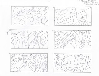
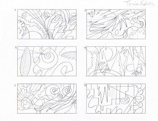
thumbnail sketches/ideas:
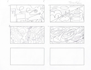


roughs of different grey values (same design):
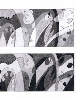
final one:
 12 step color wheel
 24 step color wheel
(the colors with dots on top of the wheel are the only paint tubes we used to mix all the other colors - 6 total)
 Complementary mute chart
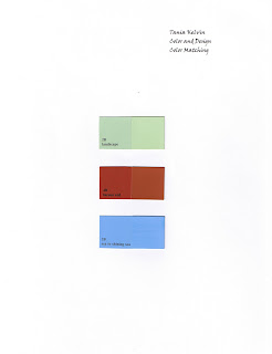
 Color matching
(had to mix colors to match hardware store paint swatches -left side are the originals, right side are mine.):
 Psychology of color
(a design to portray a feeling. we were given a bunch of single words of emotions or actions to choose from and portray in a design with the use of color.)
thumbnail sketches (i challenged myself to come up with ideas for every word we were given):


final 4:
top to bottom: joy, tension, freshness, and fast

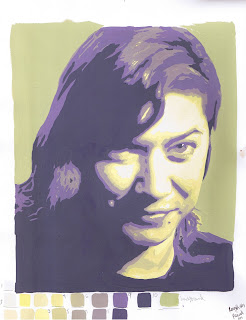
 Complementary palette self-portrait
original photo turned into black and white:
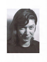
photo posterized in photoshop (10 levels):


posterized portrait pattern done by hand (like a topographic map!):

color roughs (these came out better than my final one):
 Light influence on color exercise (i only painted in the existing drawing)
(left is warm light, right is cool light)
 Atmospheric perspective exercise (i only painted in the existing drawing)
(how color effects depth)
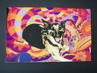
 Color and mood
idea sketches (yes, that's my loving dog Kura...who you'll be seeing more of later on in my artwork!) -


final choices/roughs (supposed to evoke a mood using design and specific color palette. the final large painting - second one - didn't come out as good as the rough...in my humble opinion.):
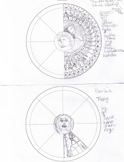
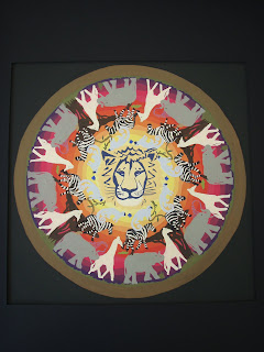
 Mandala
(circular repeated pattern, utilizing a specific color palette)
ideas (the very bottom one with the lion center was chosen):

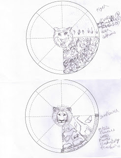
first rough:

first color rough (pencil):

second color rough (paint):

final pattern:
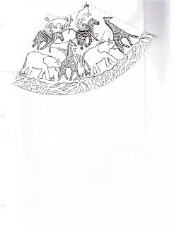
final pattern complete:
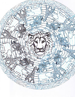
final painting:
(even though it came out nice...due to time constraints, could not add the border and giraffe patterns. will also make adjustments when i'm able to some colors per instructor's suggestions.)


 Finished wax piece:


 bottom/underneath (hollowed out):


